Five web trends over 2014 & Webigence’s thoughts on trends for 2015
Over the last 12 months certain elements of design and/or aesthetic functionality have flooded the webosphere like models flooding a catwalk in London Fashion week. The web, like catwalks, go through quick fashion trends each ‘season’ and Webigence discuss what the future may hold considering the release of 'Google's Material Design Guidelines'.
Although there are many, we’ve identified the top five for 2014 being utilised across both bespoke and templated websites.
Infinite scroll
This is one discussion at the moment that has merits for and against. With the competition of everyone clamouring to be on the first page of Google with the thought that this would add value and ultimately revenue to their business (this is separate from PageRanking), Google changed up the game (as it does oh-so-well) in taking away the numbered paging for showing ‘Images’ tab and implementing infinite scroll so there is no ‘first page’ - will they look to do this for the ‘Web’ tab too at somepoint?
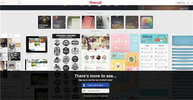
Twitter, Facebook and Pinterest have also implemented this trend in displaying their content and images. Interestingly some people have mentioned they find it annoying in that when they go away and come back to the page they can’t select the exact page they know they were looking at previously – they have to go through the whole scrolling motion again. To some extent I agree, when looking at products you want to remember for later but I think it is great for quick overview-browsing, inspiration gathering and you often look at more through this method. This can be easily overcome with the inclusion of a ‘favourite’ button, for example, enabling the user to save favourite items/pictures, and this is a much easier way to come back to them rather than having to remember which ‘page' it was on. It does, however, hinder the footer being visible on that particular page, but surely this is not the end of the world and other methods (see the next section) can be used to overcome this hindrance.
Pinning the header & footer
There are various versions of this out there at the moment with a wide variant of animations of how they appear, drop down and pull up etc.
We have worked on a few sites that include pinning the header (such as Travel Stream) and our own Webigence website) and one project had the footer pinned a bit like how Pinterest now do it or like the Pace University site.
The Lucky Magazine website uses the pinned header to enhance it’s marketing pull by keeping in eyesight other articles it wants the user to read or click on as they scroll down the page.
Iconography – Square vs Circular
This is invariably used in order to ‘simplify’ options, processes and overloading the user with too much information. These types of styles change frequently and a site can quite easily be dated (or seen as out-dated) as per what style they have chosen to trend. The ‘call to action buttons’ also fall into this category - rectangles with square corners, rounded corners, less rounded corners, social media icons that are shown within circles, squares or neither are another stylised trend that changes as quickly as the UK weather during Wimbledon!
Circular images
Full Photography/Video backgrounds
This trend has a big initial impact and WWF France’s 40th Anniversary site has full photography but takes it to another level using parallax (another current aesthetic trend) to make the bridge between still images and a video. I’m always amazed with parallax like a magpie to a shiny superfluous object but how long will it stay around for, before it too seems out-dated? 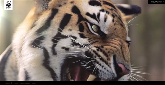
One of our clients uses full bleed photography and full bleed video (on loop) for their front end Y.CO site and on the Y.CREW site for which we are working on the backend programming.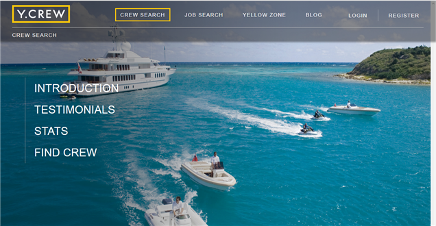
Content sections / One-page websites
Segregating content is also popular along with One-page websites. This works well if you have a minimal amount of content and you want to push people towards taking an action such as buying something.
The Lostmy.name website had a fun single-page site that took the user on a short journey of discovery (like their book does for the child who has lost his/her name) and guided the user down the page towards creating, previewing and then buying the product. They have subsequently changed their website and in my humble opinion I think they have lost the fresh/innovative interactivity element in doing so but having now sold more than 60,000 books in 60 countries across the world their direct (marketing) approach of having the information upfront to push/increase sales quicker seems to work but I wonder if they lose an aspect of excitement and anticipation.
An Awwward nominee for single-page web design is Kutikai and this innovative Wedding Party App also uses a single-page website design.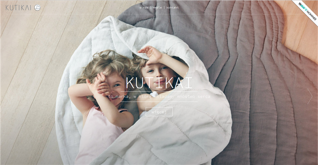
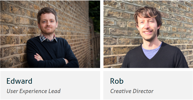
Our UX lead (Ed) and Design Director (Rob) share a few of their 2015 trend thoughts:
Bridge builders
I believe the bridge between design, development and devices will need to be more intelligent, there are so many mobile devices which all have different screen sizes that it can be a very labour intensive task to ensure your product works across all screen sizes and all devices. I believe there will be new start-up products emerging to tackle this specific area, which could have a huge impact on the industry in terms of cost saving, time saving and stripping down processes.
Meaningful interactions
'Interaction design' has and is becoming more important to an overall product experience. Earlier this year Google released within their 'Google Material design guidelines' an area dedicated to 'meaningful transitions', which simply means putting more meaning behind animations, transitions and interactions and the way people receive content. This area will be a huge trend in 2015.
More Human understanding and connection
I believe another trend for 2015 will be similar to the above but from a User Experience point of view. User Experience over the past five years has become a critical and prominent requirement within most companies. Questioning and validating a product has never been more important in an already 'flooded market place', questions such as: What is the user need? Is there a need? How do we know? Who are the people we are designing this service for? I believe there will be more values implemented into a service, more empathy, more understanding and more of a desire to add real value into people's lives. In the world we live in today the need to take a responsible and caring approach has never been more important.
Finding the balance
At Webigence we need to marry the reality of different users and the generational gaps between needing to be told or shown what to do and where to find content versus wanting to explore and find it themselves more intuitively. This is the hardest thing to balance when wanting to push a website or application forward and use some useful ‘trends’ without alienating or confusing the majority of current users.
Less is more, intimate technology that is a part of us
Google and Apple have been pioneering the way in simply communicating information and avoiding complexity, and in 2015 we will radically be seeing more of this. With the introduction of 'smart watches' information has to be so simple but highly intuitive and functional. Designing for this type of device will have a big impact on designing across all devices. Expect to see less but experience more in 2015, as the need for written information is getting smaller the emergence of 'The Internet of Things' is growing ever larger and products are becoming more intimately involved in our lives, so much so that we won't even know they are there.
Our quick predictions of what will be trending in 2015:
- Hiding content until the users wants to open/explore it.
- Adaptive and responsive web design as well as build for desktop, tablet and mobile and some sites being solely designed for touch screens like Stylepit.
- Interactivity to make the experience ‘feel’ more tactile and useable;
- Gamification (such as Asana's task completion reward), animations (such as Google describes in their 'Material Design Guidelines' and instructional overlays (Google have just done one on the update of Google drive).
- User exploration of information, engaging the user to find more and more and encourage repeat visits to the website. Go Macro is a nice (but not perfect) example.
- More innovative UI design for digital smart watches with the launch of Apple watch and Samsung Gear watch.
- Using mobile navigation patterns to help simplify traditional desktop applications. Again on Google Drive you see this when you right click and select ‘move to’ - a mobile design pattern/style of screen is being used but on desktop.
- Websites and applications becoming wider / full width with both desktop and mobile screen sizes getting bigger but also becoming more 'full bleed' or 'wrap around' in look.
Webigence specialise in ASP.NET web development for more technically complex projects. If you have a project you would like to talk to us about then please get in touch on 020 8739 0030 or email info@webigence.com.
Blog written by Natalie Wiggins