The appropriate usage of social media icons
Social media has been one of the buzz topics on the web for the last few years, and like most web design and development companies, I'm sure we are not alone in clients wanting to splash their social media icons in prominant places on each and every page. As a UX designer, I often find myself in a battle when I try to explain to clients that they are seemingly jumping on the 'social media bandwaggon', and that its not appropriate in all cases to have their social media icons where they are wanting them. This article takes a look at the appropriate usage of social media icons.
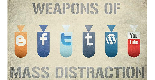
We are all now familiar with what social media is and the different forms it takes including online magazines, Internet forums, weblogs, social blogs, microblogging, wikis, social networks, podcasts, photographs, videos, ratings, reviews and social bookmarking. As social media is now a big part of our experience on the web, I can totally understand that for some clients they 'think' it's important that their social media icons are on every page and are very prominent on their website. However if you take a step back and think about this strategically, plastering your social media icons everywhere is not always as wise a move as it might seem.
What do you want the users of your website to do?
If you are a commercial B2B organisation, generally you will either want your website users to purchase your product(s) or contact you about a service you offer. So if this is the case, then why would you want to have social media icons in the header of your website, or in prominent places on each and every page that take your users AWAY from what you want them to do? i.e off to facebook/LinkedIn/Twitter. It just doesn't make sense.
Yes, sharing content is a good thing, but surely the primary goal of your website is to get your user to engage with your content and then act on it in the way you want them to (which is generally either by purchasing or contacting you). Having things like social media icons in prominant places only serves to clutter up your website and distract your users from engaging in what you actually really want them to do. You are effectively focusing on 'campaigning' over 'content' and this seems like a classic case of misplaced priorities.
The reason posts end up on facebook, LinkedIn, Twitter, or elsewhere isn’t because the your website made it easier for them to share your content, (it’s already easy), it's because people respond to a quality website with relevant content.
Matt Linderman from 37 signals puts it like this:
"Think twice before badgering readers with “vote for me” please. The hectoring is tiresome, it results in extraneous visual noise, it makes your site look cheap, and the benefits are dubious at best. Instead, focus on delivering great content. If you do, people will figure out how to spread the word just fine"
We agree with this principle in terms of focussing on creating good content and if its relevant then the user will find a way to share it.
Primary research into sharing content on websites:
Usability specilist Tania Lang, commented that depending on how these social media sharing buttons are implemented, she often found them quite annoying—adding visual noise and getting in her way when she was trying to read content. This has led her to ponder their value by conducting some usability testing to 500 people to find out how most users want to share.
To summarise her findings; how users want to share website content depends very much on the type of content they are sharing and their level of internet experience.
For targeted, serious, and commercial content, a large proportion of users preferred to share by copying and pasting the URL into an email as shown below in Figure 1. A few users also indicated they may click on an “Email” link within a page.
When it came to sharing knowledge and content from fun and entertaining websites, users’ preferred method changed significantly. The use of social networking buttons such as facebook Share and Like increased significantly and even became the preferred method of sharing a funny picture or photo.
Appropriate uses of social media sharing icons:
So, for Webigence, as a web development company that mainly works in the B2B space, these findings from Tania Lang have shown that the vast majority of our clients users will share the content by copy and pasting the URL into their email programme, and not by using the social network sharing icons. For the B2C sites that contain more fun or entertaining content then the social media icons are much more relevant (albeit sharing via copy and pasting a URL still seems to generally be the most common way of sharing content even in these cases).
We thought it would be useful to suggest a few things to consider when thinking about whether / where to place social media icons on your website:
1) Tailor your social media icons to your target audience:
Social media icons can be a useful sharing tool to have on your site, but make sure you use them appropriately. For example there is no point in having a facebook 'Share' or 'Like' icon on a totally corporate B2B website. Facebook is a social network of peoples' friends where people share their personal lives with each other, so really there isn't much point in having these share and like icons on a corporate B2B type of website as it's totally not appropriate. LinkedIn, or Twitter however would potentially be a much more appropriate social network for B2B conversations.
It's also not a good idea to litter your whole website with loads of social networking buttons that just clutter the page, instead pick the most appropriate social media icons for the platform where your target audience are most likely to be. Don't just include all the social media icons becuasue everyone else does!
2) Don't let your social media icons take over from your main website's calls to action:
As I touched on above, there is no point in your social media icons being more prominent than your main website's calls to action. When your users are on your website, generally the main thing you want them to do is to purchase a product(s), or contact you about a service you offer. So it's important that your social media icons don't visually clutter up your site and distract from the things you really want your users to do. Sharing using social media is useful, but your priority should be to engage the user on your site through good user experience and relevant and engaging content, rather than focussing on trying to get your user to tell other people about you. If your website is good and your content is relevant then your user will find a way to share it.
3) Use your social media icons in appropriate places:
Try and only include social media share icons on pages with content that users will actually want to share i.e a specific product page, or a blog article for example. There is no need to splatter your social media icons on each and every page of your website.
It's also not a good idea to include your social media icons directly below your H1 page heading. Give your poor users a chance to read something before they decide whether they want to share it! Shoving all the buttons in their faces is just likely to annoy them. For a common content area where sharing is useful - i.e a blog article, our suggestion would be to have the social media sharing icons at the bottom of a blog article so once the user has read it, then can decide whether they want to share it or not.
-----
Hopefully the above points will help you think more strategically about your social media icons - we definitely think there is a place for them, but we don't believe they are as vital as perhaps we are led to believe. Concentrate on making sure your content is good and your user will naturally find a way to share it.
Blog written byEd Kemp