Responsive websites - mobile first vs desktop first, which is better?
Having read the article by Gorka Molero 'Responsive Design is Not About Screen Sizes Any More' there has been a lot of interesting debate in the office about our own individual views on this topic (and it still continues)...
Simon (MD and Technical Lead at Webigence) and Ed (UX Lead at Webigence) discuss their views on building a responsive website - mobile first vs desktop first?

"Performance is like any other issue. Sites that overcome it are the ones who acknowledged it from the beginning. And the ones that overlook it are the ones that suffer for it in the end." Gorka Molero
Simon: I agree and believe all the things mentioned in Gorka Molero's article that are good for mobile devices, are also just as good and just as important for desktop! It’s still very important to optimize and have a fast loading desktop site. I also stand by the view that performance should be taken into account for any device including desktop. Ensuring any site we build is as efficient as it can be and considers everything it needs to is part of our build philosophy, but as in any business with any project, this does ultimately (and sometimes unfortunately) come down to client priorities, budget and time constraints.
Having worked in the web industry as a programmer for 12 years, I’ve always maintained that you should be able to have all of the content across all devices, but agree that any sites the size and scale of BBC should consider server side device detection (as they describe it as 'cutting the mustard') type templates to return slightly different content for different devices. However, the BBC aren’t yet perfect with regards to mobile websites as yet.
In fact it was only last year that they made a significant improvement to their mobile site (prior to that the BBC mobile site showed only a very very limited amount of the content and was therefore essentially unusable), and personally I still get frustrated that the sports pages don’t show all the content of the main website – e.g. the BBC Sport homepage on a Saturday (and during the premiership football matches) shows a list of all the current fixtures and the latest scores, and the latest standing in the league table. On an iPhone I simply can’t access this same information and have to scroll through sometimes lots of ‘Live text’ of the current matches to simply find out the latest scores and even then I can’t necessarily be sure I've found every match current score – just one example where someone at the BBC has decided this information isn’t necessary for mobile.
How many more times does this situation occur? If it’s important enough to include on the desktop why is it not considered important enough to be included on the mobile version?
Generally web designers and developers should be keeping it simple on a desktop screen anyway, so the pages aren't too cluttered and this comes down to smart and effective wireframing to get the balance right – then we can adjust responsively. Start with the largest 'experience' and work your way down the device sizes, bearing in mind responsiveness will evolve and improve further with the growing demand of different sized devices. My stance is that where possible and as a guiding principle, try to ensure all the information is available to all users (/devices).
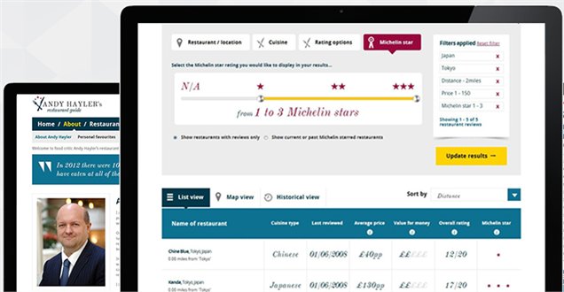
Ed: Having thought about the mobile first vs desktop first discussion over the past year or so, I think the best approach is to actually design the site at the width that is most commonly used for the particular website's target audience. Take a look at the site analytics and, for example, if Andy Hayler's or Travelmappers have more people who actually access their sites from a tablet or mobile initially then the starting point for the design should be considered based on these devices first.
Andy Hayler has a great desktop experience but if most of his users look at his site on their mobiles when sitting in hotel rooms on their travels then the experience they are getting might not be as good as the one they would get if they sat at a desktop.
Therefore, I think it's important to consider what devices the client's main Target Audience is using. If they are using mobiles then I don’t think a desktop first approach is necessarily the correct approach and visa versa.
Simon: Luke Wroblewski's statement that you should be "designing mobile first" isn't the right approach in my opinion. We all know that web/device boundaries are continuously being pushed with already a large amount of different screen sizes and mobile screens are getting bigger - making them closer to tablets/desktops anyway.
But, I agree, if there is a website that gets the MAJORITY of traffic to the mobile site then it would make sense to wireframe and design specifically for mobile – although what size does that mean exactly given there are so many tablet/mobile sizes? It would be better to plan around the largest size and then still shrink down as we do now for smaller ones. But tablets/mobiles (and probably desktops) will mostly likely continue to have larger screens, so it may still be a bit of a moot point to some extent.
Ed: Sure, agreed. I don’t think we can definitively say that either a desktop or mobile first approach is the best way for every site, each site needs to be considered separately. I think it's about designing it initially to the screen size that whatever the majority of users are using whether that’s desktop/tablet or mobile and then scaling that up or down accordingly for the other sizes.
Simon: If a site was used 51% mobile, 49% desktop then I’d still say we should do desktop first and scale down – of course then the site that’s wireframed/designed/built should still then have it in mind that it will be used by lots of mobile users. If you do design for mobile first, how would that translate to desktop? This is still something we’d have to think about and work out and brings me back to my point that you should be able to have all of the content across all devices. It is all about the experience when you’re navigating through a website and users on a desktop, mobile or tablet should not be penalised (i.e. not able to see certain content) because of the size of their device.
“You don’t get to decide which devices access your site, your users do” ~ Karen McGrane
Ed: Axure are introducing responsive wireframes in their next launch which is an interesting addition. So it will be good to see how these 'AdaptiveViews' based on browser width and/or height will work and demonstrate to clients more each experience they will get on each device. 
Simon: In the same vein as Karen’s quote, and my previous point, I would say that irrespective of the device your users are accessing your website from, you don’t get to decide what content your users have come to your website to access, your users do.
Ed: I personally think its VERY difficult to display ALL the content on a mobile device especially on large websites such as the BBC and I think its perfectly reasonably as a user to expect that I will get to see more view/additional content the larger the screen gets as there is more room to display it. I would much rather have a cleaner more focussed mobile version of a site rather than a mobile version that crambs/stuffs too much content into a small space. Another example would be a mobile version of a banking website – would you really expect it to be able to do everything you can on a desktop version of the site? So likewise I don’t think you can expect exactly the same with a huge website like BBC sport. BBC sport may have decided that after looking at the stats/analytics for the live league tables page that hardly any of their users look at this and most people are simply interested in the live scores for their team.
I don’t think you can apply a hard and fast rule here which works all the time, my view is that you take each project as it is and then make a decision on what content is displayed based on looking at who the target audience are, how they will be using the site and the analytics available to you.
Simon: but why should people expect to only have limited functionality on their mobile devices? In this day and age someone navigating a website from a mobile isn't necessarily 'travelling' or 'on-the-move' and therefore only wanting to spend 20 seconds on the website or flick through minimal content.
Luke Wroblewski highlights some really interesting stats:
Where are people using mobile devices?
84% at home
80% during miscellaneous downtime throughout the day
76% waiting in lines of waiting for appointments
69% while shopping
64% at work
62% while watching TV (alt. study claims 84%)
47% during commute in to work
For functionality it’s slightly different – if it simply isn’t possible to perform the functionality due to the constraints (screen size or touch interaction) of the device, then that’s a reason why the mobile version HAS to perform differently, but I really don’t see how a sweeping statement can be made that I’m a minority looking for certain information or in any other case (without absolutely cast iron stats to back it up) that it could be possible to say that people on a mobile won’t want certain data and informational content. It’s not even difficult to display this information – it’s only text content after all – so why hide it?
So, going back to Ed's question about a banking mobile site (would you expect the mobile site to do everything the desktop site can do), my answer would be it depends what the desktop site can do and whether it's possible to effectively transfer the same functionality across to the mobile site. Regarding the information and the content, if it's useful content (which it should be if it's being displayed on the desktop site) then I believe the starting point would be that it should be included. One example of something to exclude might be monthly bank statement PDF downloads, on the basis that these wouldn't (perhaps shouldn't) be stored on a mobile device, so better not to provide the capability on those devices.
The BBC website on the other hand is primarily an informational website, and it's that information that I believe shouldn't be precluded from users based on a non-scientific and subjective basis about what the users may or may not want to have access to, or even based on it being a little bit difficult to work out how to display all the information on the small screen.
Regarding the use of analytics to determine what to include and what to hide, unfortunately this isn't straight forward as continuing with the example of the BBC Sport website and the match day league tables and scores, these are on the BBC Sport homepage and the 'live text' page, so it's impossible to know whether the user is viewing the desktop or mobile sites specifically for a certain part of the information on these overall pages - no automated analytics package is going to give you accurate enough information to make this type of judgement.
So, again in my admittedly subjective opinion, the starting point should be to always show all the information and content, and only strip out content when you can be absolutely sure that it's not required to users on a particular device - but I again would say that if it's not useful to people on a mobile device then are you sure it's actually useful and worthwhile having it on the desktop device?
"There is only one scenario where you can serve users an obese website and get away with it: serving it to their Macbook Pros, while they are at home with full bandwidth." Gorka Molero
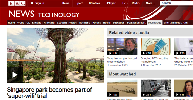
Simon: Mobile devices are getting faster, 4G is coming, there’s more Wi-Fi around (for example Singapore's "super wi-fi" white space programme), broadband is getting faster etc – so all this talk of having to make content more optimised for mobile delivery is potentially just a temporary issue and a waste of time focusing on. Yes, if we were doing a site where we were targeting another country where broadband/wi-fi/3G/4G were less used, then absolutely we should consider greater efficiency (but that would still be important for people on desktops in those countries too).
Gorka Molero mentions 'Lazy loading' and coding "for the lowest resolution and possibilities". Generally I believe sites should be kept as efficient and light as possible and where feasible anything that means we can load later (e.g. lazy loading) is a good idea, particularly with regards to images.
Webigence has used lazy loading images (a jQuery plugin) for years, but lazy loading of HTML content e.g. infinite scroll as we’ve done on for Skills Platform search and on our product WebiCart (coming soon) is also a good idea.

Our way of working is pretty good in my opinion – not necessarily 100% right - the moment we think it is, is the moment we start to fall behind! We want to keep challenging ourselves to develop the best websites we can and part of this is to challenge our clients to be a bit more open to trying something new or different from what they have done before. Obviously this means a bit of cooperation, discussion and compromise is inevitable. But if we're not pushing the boundaries and continually thinking about and evolving our practices, then we'll get left behind.
Webigence are a forward thinking web development agency with a committed team of digital experts. We specialise in bespoke multi device ASP.NET digital solutions for more technically complex projects. If you have a project or website you would like to talk to us about then please get in touch on 020 8739 0030 or email info@webigence.com and we'd be happy to chat it through with you.
Blog written by Natalie Wiggins