Data is Beautiful
Data is everywhere, it is inexorable, there are impossibly large and inexplicably complex sets of data behind everything. On its own, this data is arbitrary at best, meaningless at worst.
A big part of my job here at Webigence is to take data and display it in a meaningful way. This probably conjures up visions of Excel dashboards with endless pivot tables. Whilst I love a good spreadsheet, this couldn’t be further from the topic of this blog.
But when this data is collated in to infographics or visualisations, we can digest it in a way that is comprehensible, interesting, or even beautiful. For example, did you know that Facebook, something that 728 million daily users take for granted, has roughly 60 million lines of code backing it? There’s a good chance that, unless you’re like me, this factoid isn’t particularly interesting. But, when collated with similar data, the result is a beautiful visualisation that gives a glimpse into the complexity of software.
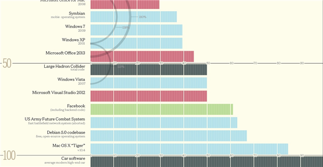
Big phat credit to David McCandless at InformationIsBeautiful.net
(Original image: http://www.informationisbeautiful.net/visualizations/million-lines-of-code/)
Data used for Heatmaps
At this point I want to briefly explain the point of this blog and why I’m writing it. Two hobbies of mine are cycling and reading maps. Both complimenting each other rather nicely, I think the best way of exploring this little island is by bicycle. Also, I find pouring over maps oddly cathartic. I mean, who hasn’t spread out an OS map of the Weald over their living room floor and spent hours tracing tracks and bridleways? But I digress.
If you're on the running or cycling scene, chances are that you've come across and app called Strava. For those who aren't, Strava is an app used to track and record athletic activities via GPS. Over the years, they’ve built a serious user base and have been doing some interesting things with the data that they’ve accumulated. For example, you can see how many activities are synced every second here; http://labs.strava.com/.
By far the most interesting project in the labs is the global heatmap. If you're unfamiliar with the concept of heatmaps, they’re a graphical representation of data displayed as colours. 'Hotter' colours representing a more dense collection of data. They are capable of displaying billions of points of data - which is just meaningless on its own...
...into, you guessed it, a beautiful visualisation.
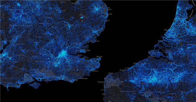
But is there a practical application for beautiful visualisations of data? Certainly. For one, they make for incredibly useful web analytical tools. Case in point, heatmap, a real-time analytical tool that gives a much more meaningful represetation of user's interactions with a web page, by displaying clicks as a heatmap.
Strava believe that data visualisations can be used to provide better infrastructure for cyclists and pedestrians with their Metro service, aimed at city planners, advocacy groups and transport departments alike to provide a deeper insight and analysis into activities in city areas.
You can also get wearable data, if you so desire, with jewellery such as a ring showing the representation of the growth of the world population on the planet since 1960. Or maybe a necklace that represents the data of the world’s production of carbon dioxide divided by macro regions.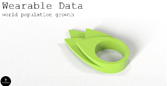
Data is collected from everywhere
You may be surprised to learn that your smartphone (unless you have told it otherwise) will routinely ‘ping’ Google’s servers with your location. (you can view your own data here) Google makes very good use of the data that it accumulates from you; it can accurately predict commute times, give you directions to places you’ve been in the past and fine tune search results based on places you visit the most. Google collects a lot of big data
The article 'The Future of Big Data' states that "the projected growth of data from all kinds of sources is staggering" and that "human-created information is only part of the story, a relatively shrinking part....other places are generating data and sharing it directly with data “readers” and other machines that do not involve human intervention." The amount of data that is collected every day around the world is growing and, if harnessed properly, the knowledge and insight gained can be bought and sold at high rates.
The Economist quoted Rollin Ford, the CIO of Wal-Mart in 2010 as saying "Data are becoming the new raw material of business: an economic input almost on a par with capital and labour. ‘Every day I wake up and ask, “how can I flow data better, manage data better, analyse data better?”
The power of Big Data
Big Data is a key topic that has been discussed at length for a while now, across everything from Sport technology to Interesting technology to help you in your job. Data collection and analysis is a big deal but the next question is one of privacy. Should your privacy be compromised by companies collecting your data?!? Are you even aware that they are collecting your data without permission?
Blog written by Dave
Follow us on Twitter to keep up to date with the next instalment Big Data and privacy: will we ever truly have privacy again?
You can also find other interesting topics discussed on our blog page such as F# vs C# - what is this programming key change all about?