Portrait Monitor Screens? Any thoughts?
All Webigence staff have two monitor screens to work from (often one being a laptop screen). I had some issues with the colours seeping on my main screen so we ordered a new one which, during setup, I found swivels 180 degrees so that you can have it standing in a portrait position! This got me quite excited and I thought I would use it in this portrait position to see if it was a good or possibly even a better way of working...
Image 1: Trying it out for size 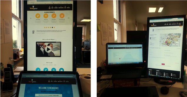
Pros
- It takes up as less space on my desk (if I am only using the one screen and a keyboard)
- With having the both the portrait monitor and the landscape laptop screen I could get the best of both worlds.
Cons
- It is too tall so I have to slightly stretch my neck and strain my eyes to see the top (not excessively but even doing it a small amount constantly over a period of time is tiresome and bad for your posture).
- I can’t actually flatten/straighten the screen properly so it is on a slight tilt which is annoying but only due to the fact that I am small in height myself so can’t have it on the highest height which then allows room to flatten the screen.
- Most websites are built considering the width so instead of scrolling down with my mouse roller ball I have to scroll sideways with the screen scroll bar.
- In my particular case my laptop is my 'computre' so I had to have the screen, laptop and a keyboard - which took up far too much space in the end.
After setting it up, I got a few comments in the office like; “wow that screen is huge”, “...is this the new Apple 10!?!”
Having tested it out for a week in various layouts I did like the layout shown in image 1 (above) and tried splitting the large screen in two it still didn’t quite work as well. But with my laptop screen working on landscape I had the best of both worlds, but it then took up more space on my desk. but it was when working on a spreadsheet for a project schedule that made me decide to switch back.
The ‘conditioning’ of being used to/familiar with having my screen in a landscape position did make me question why screens were designed and built landscape in the first place. We read books portrait so why not websites portrait? TV and computer screens started off square - so why did they then expand sideways? Most probably because it more practical space wise.
Image 2: The (quasi) evolution of computer screens 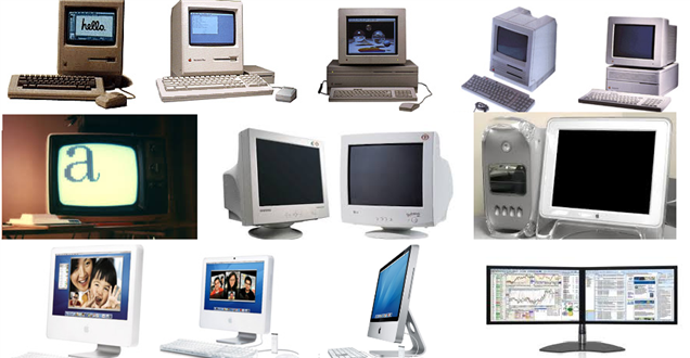
I do think this might be worth more exploration and thought but I think with websites still predominantly focused towards a landscape layout the ‘trend’ won’t change until someone with kudos, like Apple, makes a huge leap that we all inevitably follow.
Image 3: My final decision...for now 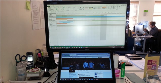
Blog written by Natalie Wiggins