Parallax, responsive design & pin to browser becoming mainstream
The launch of the new ITV.com site was released last week, and I couldn't help but notice that this is one of the first major corporation websites that uses three of the latest modern website techniques; Parallax scrolling; Responsive design; and pin to browser.
Lots of the framework for these three elements, parallax, responsive design, and pin to browser have been around for a while, although unless you work on the web like I do, and look at award winning sites for inspiration you might not have seen them as most of these sites have been done by smaller "in the know" web development companies.
Over the past few months I have noticed these three frameworks starting to break out across the web a lot more, and it seems like they have now reached the mainstream with all three of these frameworks now included in the new ITV.com home page.
As Parallax scrolling; Responsive design; and Pin to browser are now coming more into the mainstream, I thought it would be worth explaining a bit more about what they are, using the new ITV site to demonstrate:
Responsive design:
"Responsive" design refers to a website that automatically adjusts the structure and layout based on different screen sizes, so when viewing on a tablet or mobile the website will adjust to work in an appropriate way based on the screen size.
This responsive design approach is based on Media Queries which in themselves consists of a media type and an expression to check for certain conditions of a particular media feature. The most commonly used media feature over the years has been to set a different style to a webpage when you physically print the page although for responsive design the key attribute is to set different stylesheets to be used on the webpage based on the screen width.
By restricting CSS rules to a certain width of the device displaying a web page, one can tailor the page's presentation across devices (i.e. smartphones, tablets, netbooks, and desktops).
Here is the new ITV.com site showing in a responsive way:
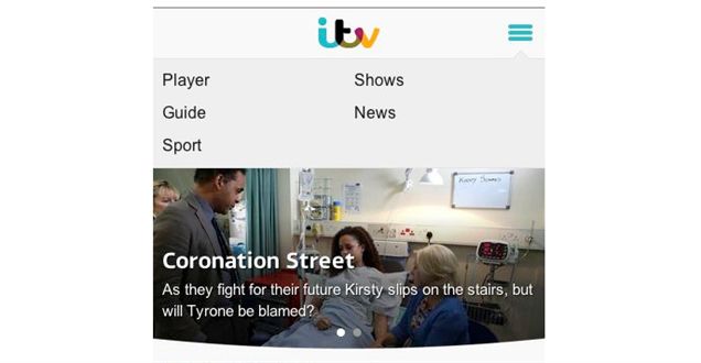
Responsive design is becoming more and more common on the web, and will no doubt continue to grow in 2013 as it’s by far the best way to handle tablets/mobiles and any size of screen.
We launched a few responsive websites towards the backend of 2012 (which we will add to our portfolio soon - when we get a chance!), and we are already are working on several more responsive sites for our clients. We also need to make the webigence.com site responsive but its a case of finding the time more than anything!
We normally include responsive design as an optional stage when we quote for new projects, but we are finding more and more that clients are wanting to progress with making their site responsive as in this day and age you simple can't ignore the increasing browsing habits accross mobile and tablets.
If you would like to talk to us about making your site responsive for mobile and tablet devices then please do get in touch 020 8739 0020 or info@webigence.com.
Pin to browser:
Another nice element which is starting to become more common place on the web is the ability to have objects in a fixed position - these are known as 'Pinned Items" and they work by using CSS fixed positioning.
Pinning an item to the browser essentially means that it doesn't move when other objects on the webpage might move, and your pinned object will stay displayed in one location in the browser.
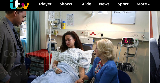
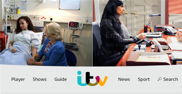
On the ITV.com new home page, you will notice as you scroll down the page that at a certain point when the main naviagtion hits the top of the browser it becomes a "pinned item" to the top of the browser.
Traditionally webpages were shorter in length and users didn't expect to have to scroll too much to find what they were looking for, we had the whole "Above / Below the fold" consideration. Back then, if a page did become too long we used to include a 'back to top' link which once clicked would link to an Anchor point at the top of the page.
However these days as the user now expects web pages to be longer and they also expect to have to scroll to access certain content (especially on mobiles), pinning items is a very useful usability feature to consider including in your website. Pinning to browser is a great way of making sure your most important content, or your main navigation, or your call to action stays present in the users view at all times.
Parallax Scrolling:
Parallax scrolling has been around for many years and has most commonly been recognised as being a special scrolling technique used in computer graphics, wherein background images move by the camera slower than foreground images, creating an illusion of depth in a 2D video game.
More recently Parallax scrolling has started to move over into the web design and development world, but has only really been the sort of experience the "trendy" type designers that want to win awards would include.
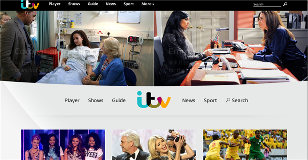
Parallax scrolling hasn't typically been used by any major corporations to date, but again this is another feature that ITV have included in their new home page:
I have seen plenty of examples of parallax scrolling where the designer has gone way too far with it to create a vastly complex site that does nothing other than leave the user feeling confused about where to look, and what to look at. However the best uses in my opinion are where it is used more minimally and where it doesn't distract or confuse the user.
I think ITV have done this well here on their new site by ensuring they use it in an appropriate way to create an interesting depth to the top of their site and haven't overdone it. As it's something the general public are still getting used to on a website (even though its been in computer games for years!), I think this is a sensible approach to take from ITV.
Never stay still on the web, or you will find yourself falling behind!
If you'd like to talk to us about any of the elements covered here, or indeed about anything else please do get in touch 020 8739 0020 or info@webigence.com.
Blog written byEd Kemp