Examples of 'Horizontally' responsive websites (including the new myspace.com)
Recently the new myspace site was re-launched, and whilst there have been alot of articles written which analyse the new/updated social media platform, I wanted to focus this blog on looking at the new myspace site from a UX perspective and in particular the horizointally responsive nature of their new web applicaiton platform.
Traditional 'Vertical' Responsive design:
Here at Webigence we believe that Responsive design is by far the best way to handle tablets/mobiles of any size screens over a seperate mobile optimised site (Google also promotes this notion too). Our approach is to produce a fluid layout and responsively (with changing widths) and adaptively (by detecting changes in device and screen size on the server side and/or in Javascript) change the website to suit the device the website is being viewed on. There is definitely an art and a science in this (iterative) process, and it’s still a relatively new field, but we believe we approach it in an appropriate and effective way to ensure we produce an effective solution for every screen size and device;
We have launched several 'vertically' responsive websites this year, of varying size and type (mostly fairly complex websites with lots of different page templates), and we have several more in production and set to go live in the next couple of months.
A new trend for 'Horizontally' responsive websites?
However recently we were approached by an Decorative Antiques dealer to create a 'horizontally' responsive website, and we knew straight away this would be more of a challenge as generally the web and websites are designed and intended to be vertical.
So at that point we searched the web and noticed there were hardly any sites which were fully horizontally responsive and the only ones we could find were only partially horizontally responsive.
Here are a couple of Horizontally responsive sites we found:
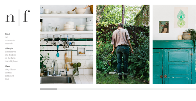
1) Nicole Franzen is a photography site which contains horizontally responsive images, which if you reduce your browser height by dragging the height upwards you will see the images adjust accordingly to the height of the site. The left menu, and some of the non 'image' based pages are however not horizontally responsive. Also when you get down to view the site on mobile devices, the site becomes vertically scrolling.
2) Maria Kapajeva is another site which we have found that is horizontally responsive with the images adjusting when the height of the browser is increased / decreased. However like Nicole Franzen this site also doesn't cater for the left menu and some of the non image based pages being responsive. This site also displays the vertcially on a mobile too.

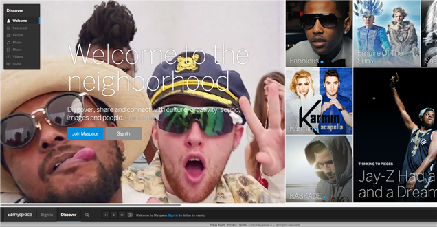
New Horizontally responsive Myspace site:
So its interesting to see that myspace seem to be the first major mainstreem site to take the horizontally responsive approach which is a bold move considering the real lack of even smaller underground site which have yet to take this approach.
Myspace
This leads us to wonder whether horizontally responsive sites are something we will be seeing more of in the future and also whether this could be a new direction web design and development is going. Its also interesting that this is a real statement of intent from myspace in an attempt to position themselves in terms of being 'cutting edge' and challenging the staus quo of everyone doing responsive sites vertically. It's something we will certainly be keeping an eye on over the coming months ahead.
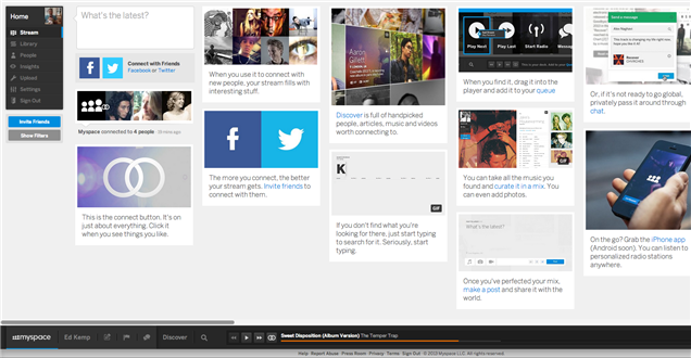
When looking over the new myspace site, I couldn't also help but notice it also contains alot of the recent web trends and technologies that are currently very hot in the world of web design and development. Here are a few thoughts and examples:
- Myspace's new offering combines photos, videos, friends, and music, so its kind of a blend between Facebook/Flickr, Vimeo/Youtube, and Spotify/Grooveshark all rolled into one to be all your social content in one place.
- The site uses a very similar approach to dragging and displaying the music playlists as an existing free online music streaming site Grooveshark already have
- It has been designed very much in a 'web-application' style which is currenltly very hot in tablet and mobile design where large Icons, clean colours, and clear / spacious layouts are very on trend. The new myspace site also seems to take inspiration from the flat windows 8 design direction, which apple have also recently moved towards with their new iOS7 redesign.
- It also uses another of the web's trendiest techniques called Parralax, and when you scroll you see the parralax effects with the background images.
- It has video embedded on the page playing on a loop which is again something which trendy websites are starting to more commonly use.
- Its also one of the first sites I have seen where the 'account/profile' information is at the bottom of the screen which is perhaps again mobile esq' in its positioning as this type of bottom 'pinned to broswer' navigation is seen more commonly in mobile devices (as the navigation is therefore nearer to the users thumb so is therefore easier to press and use more comfortably using your thumb).
- Whilst the new myspace site has been launched as a desktop version it doesn't seem like the mobile version is compleately finished yet, but from looking at the site on a mobile device, it seems like at the moment myspace are using using both horizontal and vertical scrolling on the mobile device. I particularly liked the consistency of using horizontal swipping to view the 'people browse' functionality (and I wonder if they will roll this type of horizontal navigation out on other parts of the mobile version of the site too)
So lots to consider here, both now in terms of looking at the sites that are horizontally responsive especially myspace, but also the considerations of horzontally responsive sites going forwards and whether this is going to be soemthing that catches on and other brands follow suit.
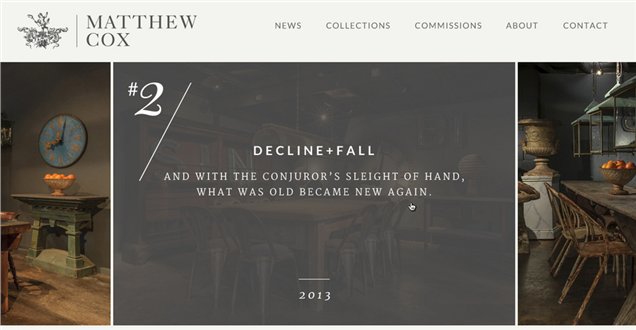
New Horizontally responsive site from Webigence!
At Webigence we are always interested to see where the web is going and what latest design styles, layouts, programming languages and functionality is coming next.
In terms of the site we are working on, all I can show you at the moment is a sneek preview of the design, which the client Matthew Cox is really pleased with, and then when we come to build the site and launch we will share more. Here is a screenshot below to wet your appetite in the mean time...
Do get in touch if you would like to discuss making your new website horizontally (or vertically) responsive 020 8739 0020 or info@webigence.com
Blog written by Ed Kemp